
Color is everywhere—it shapes our experiences, influences our emotions, and even affects our decisions. From the calming blue of the sky to the fiery red of a sunset, colors have a profound psychological impact on the way we feel, think, and interact with the world.
Whether you’re decorating your home, choosing an outfit, or branding a business, understanding the psychology of color can help you make intentional choices that enhance your mood, productivity, and overall well-being. In this blog, we’ll dive deep into the fascinating world of colors, exploring how they influence our emotions, energy levels, and daily experiences.
The Science Behind Color Psychology
Color psychology is the study of how colors affect human behavior, emotions, and decision-making. While colors are perceived differently across cultures and personal experiences, studies have shown that they can trigger specific responses in the brain.
For example, marketing experts use color psychology to influence consumer behavior—fast-food chains often use red and yellow because they stimulate appetite and urgency. Similarly, interior designers use soft blues and greens to create relaxing environments.
Our response to color is deeply rooted in psychology, biology, and even cultural associations. Some colors naturally evoke feelings of warmth and energy, while others bring calmness and tranquility.
How Colors Affect Our Mood and Emotions
1. Red: Passion, Energy, and Power
Red is a bold and attention-grabbing color. It’s associated with passion, love, and excitement, but also with urgency and danger. This is why red is often used in warning signs, sales promotions, and even romantic settings.
How red affects us:
✅ Increases energy and heart rate
✅ Stimulates appetite (common in restaurants)
✅ Creates a sense of urgency (used in sales and marketing)
✅ Evokes passion and excitement
Where to use red:
- Dining rooms (to encourage conversation and appetite)
- Branding and advertising (to create urgency)
- Accent decor for bold, energetic spaces
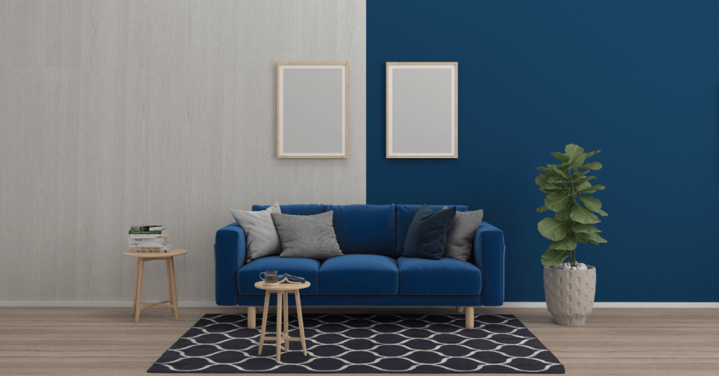
2. Blue: Calm, Trust, and Stability
Blue is one of the most universally loved colors. It’s often associated with peace, trust, and intelligence. Lighter blues bring a sense of calm, while deeper blues evoke professionalism and confidence.
How blue affects us:
✅ Lowers stress and blood pressure
✅ Enhances productivity and focus
✅ Creates a sense of trust and reliability
Where to use blue:
- Bedrooms and bathrooms (for relaxation)
- Office spaces (to increase concentration)
- Branding (used by banks and tech companies to build trust)
3. Yellow: Happiness, Optimism, and Warmth
Yellow is the color of sunshine, happiness, and positivity. It’s known to boost mood, stimulate creativity, and bring warmth to a space. However, too much yellow can feel overwhelming.
How yellow affects us:
✅ Boosts energy and optimism
✅ Encourages creativity and innovation
✅ Stimulates the mind and nervous system
Where to use yellow:
- Kitchens and dining areas (to create a warm, inviting atmosphere)
- Creative workspaces (to inspire fresh ideas)
- Entryways (to make spaces feel bright and welcoming)
4. Green: Balance, Nature, and Harmony
Green is the color of nature and renewal. It symbolizes balance, growth, and peace, making it one of the most soothing colors for the human eye.
How green affects us:
✅ Reduces stress and promotes relaxation
✅ Enhances focus and mental clarity
✅ Creates a sense of harmony and balance
Where to use green:
- Living rooms and bedrooms (to bring a sense of tranquility)
- Home offices (to boost concentration)
- Indoor plants and decor accents for a natural feel
5. Purple: Luxury, Creativity, and Spirituality
Purple has long been associated with royalty, luxury, and mystery. It also stimulates creativity and spirituality, making it a popular choice for artistic and meditative spaces.
How purple affects us:
✅ Encourages imagination and inspiration
✅ Adds a touch of sophistication and elegance
✅ Creates a sense of mystery and depth
Where to use purple:
- Bedrooms (for a luxurious, calming effect)
- Creative spaces (to inspire artistic thinking)
- Branding (used in beauty and luxury industries)
6. Orange: Energy, Warmth, and Enthusiasm
Orange is a vibrant color that combines the warmth of red with the happiness of yellow. It’s often associated with enthusiasm, motivation, and adventure.
How orange affects us:
✅ Increases energy and social interaction
✅ Encourages excitement and creativity
✅ Creates a sense of warmth and approachability
Where to use orange:
- Gyms and workout spaces (to boost motivation)
- Living areas (to create an inviting and energetic atmosphere)
- Marketing and advertising (to grab attention)
7. White: Simplicity, Purity, and Minimalism
White represents cleanliness, simplicity, and purity. It creates a sense of openness and can make small spaces feel larger. However, too much white can sometimes feel cold or sterile.
How white affects us:
✅ Enhances a sense of space and brightness
✅ Creates a minimalist and modern aesthetic
✅ Evokes feelings of cleanliness and simplicity
Where to use white:
- Small rooms (to make them feel bigger)
- Kitchens and bathrooms (for a fresh, clean look)
- Minimalist designs (to create a sense of calm and simplicity)
8. Black: Power, Elegance, and Sophistication
Black is a powerful color that exudes elegance, mystery, and strength. While it can be bold and dramatic, too much black can make a space feel heavy.
How black affects us:
✅ Creates a sense of luxury and sophistication
✅ Adds depth and contrast to designs
✅ Evokes authority and confidence
Where to use black:
- Accent walls and furniture (for a modern, high-end feel)
- Fashion and branding (to create a timeless, chic look)
- Statement decor pieces (to add drama and contrast)
Choosing the Right Colors for Your Life
The colors you surround yourself with have a lasting impact on your emotions and well-being. Whether you’re redesigning your home, picking a new wardrobe, or branding your business, understanding the psychology of color can help you create spaces and experiences that uplift and inspire.
Here are some quick tips to help you choose the right colors for your life:
✅ For relaxation: Stick to soft blues, greens, and neutrals.
✅ For energy: Use bold reds, oranges, and yellows in moderation.
✅ For focus: Opt for muted tones of blue and green in workspaces.
✅ For elegance: Incorporate deep purples, blacks, and metallic accents.
Color isn’t just decoration—it’s a powerful tool that can shape how we feel, interact, and live. Choose your colors wisely, and watch how they transform your world!
Need help bringing color into your home? At Klussman Home Remodeling, we specialize in home upgrades, remodeling, and handyman services to create the perfect atmosphere for your space. Contact us today to start your transformation!
📞 Call us now! | 469-328-5343 | 📍 Orlando, FL
